City Paper Print Redesign
Role: Creative Direction, Branding, Design
Contributors: Maddie Goldstein, Design Assistant; City Paper editorial staff
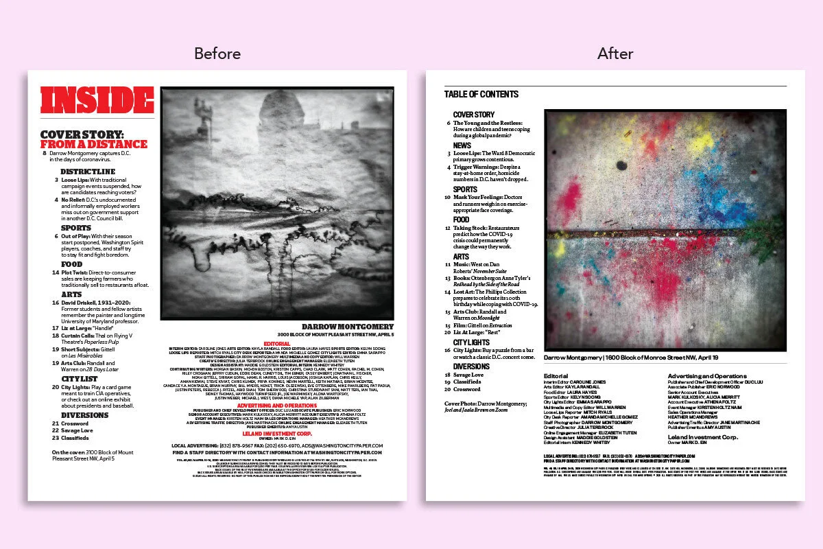
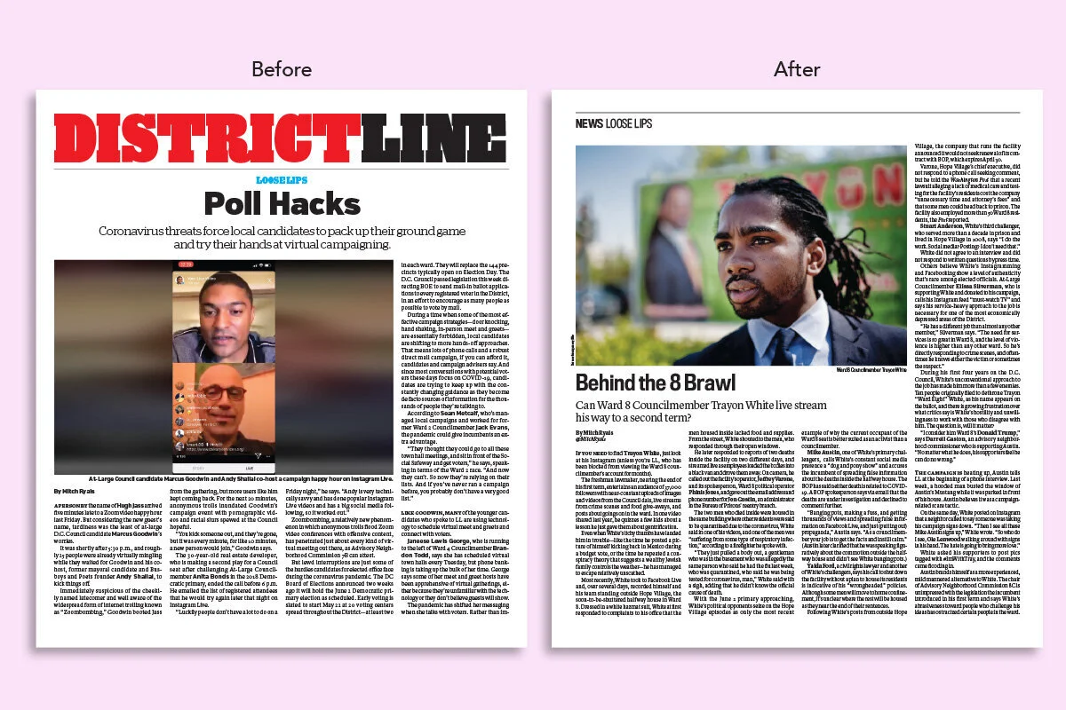
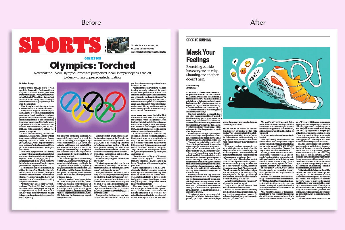
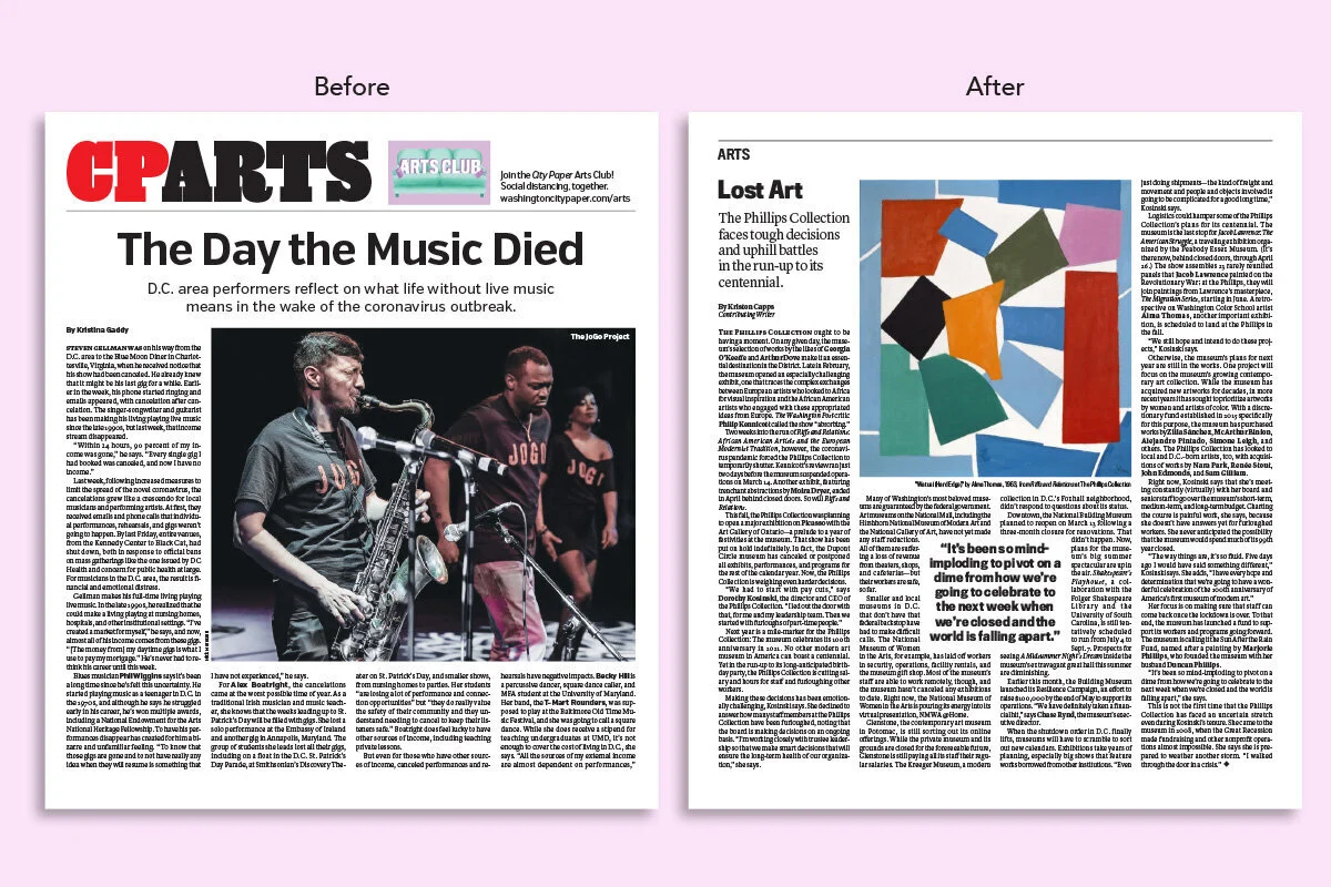
I initiated, planned, researched, and executed a new print design that improved the readers’ user experience. I was intentional about making this a budget-friendly redesign for the scrappy newspaper: the total cost was just under $500. In less than five months, with City Paper’s Design Assistant Maddie Goldstein, we researched the history of City Paper’s past designs; created multiple drafts of the redesign for review; collaborated with the editorial staff and received feedback for improvement; made editorial decisions to clarify the navigation of the paper; created an InDesign master template and style guide for the newspaper; and executed the redesigned paper in April 2020. The redesign maximized space for editorial content and strengthened City Paper’s brand on digital platforms with consistent design elements and typography.
The paper took a visual direction that is specific to newspaper design: There are no spot colors in the paper. The black and white motif of the redesign reflects the paper’s against-the-grain, alt weekly spirit and gives a serious, credible tone to the reporting. Color is exclusively used in graphics and photography, placing a higher emphasis and importance on original visual work. The number of typefaces is minimized to two for greater consistency. The navigation of the paper is more organized and outdated section names were tossed out. Above all, the redesigned pages maximize space for editorial content, meaning higher word counts and larger graphics and photography.
Another significant change is City Paper’s new tagline printed on the front cover: The District’s Free Weekly Since 1981. City Paper’s ethos, mission, and legacy are clearly stated: It will always be the District’s hyper-local paper, producing free, accessible, and high-quality journalism for everyone and anyone.
City Paper Style Guide 2020
Role: Creative Direction, Editing
Contributors: Writing and Design by Maddie Goldstein, Design Assistant
Edited a style guide that outlines editorial decisions for Washington City Paper’s 2020 print redesign. The style guide’s content includes information such as logo usage, typography, and paragraph/character styling for each page of the newspaper. Written and designed by Maddie Goldstein, a close collaborator on the print redesign.
City Paper’s Best of D.C. Issue Redesign, 2020
Role: Creative Direction, Art Direction, Branding, Design
Contributors: Maddie Goldstein, Design Assistant; Ronan Lynam, Freelance Illustrator; City Paper staff and contributors
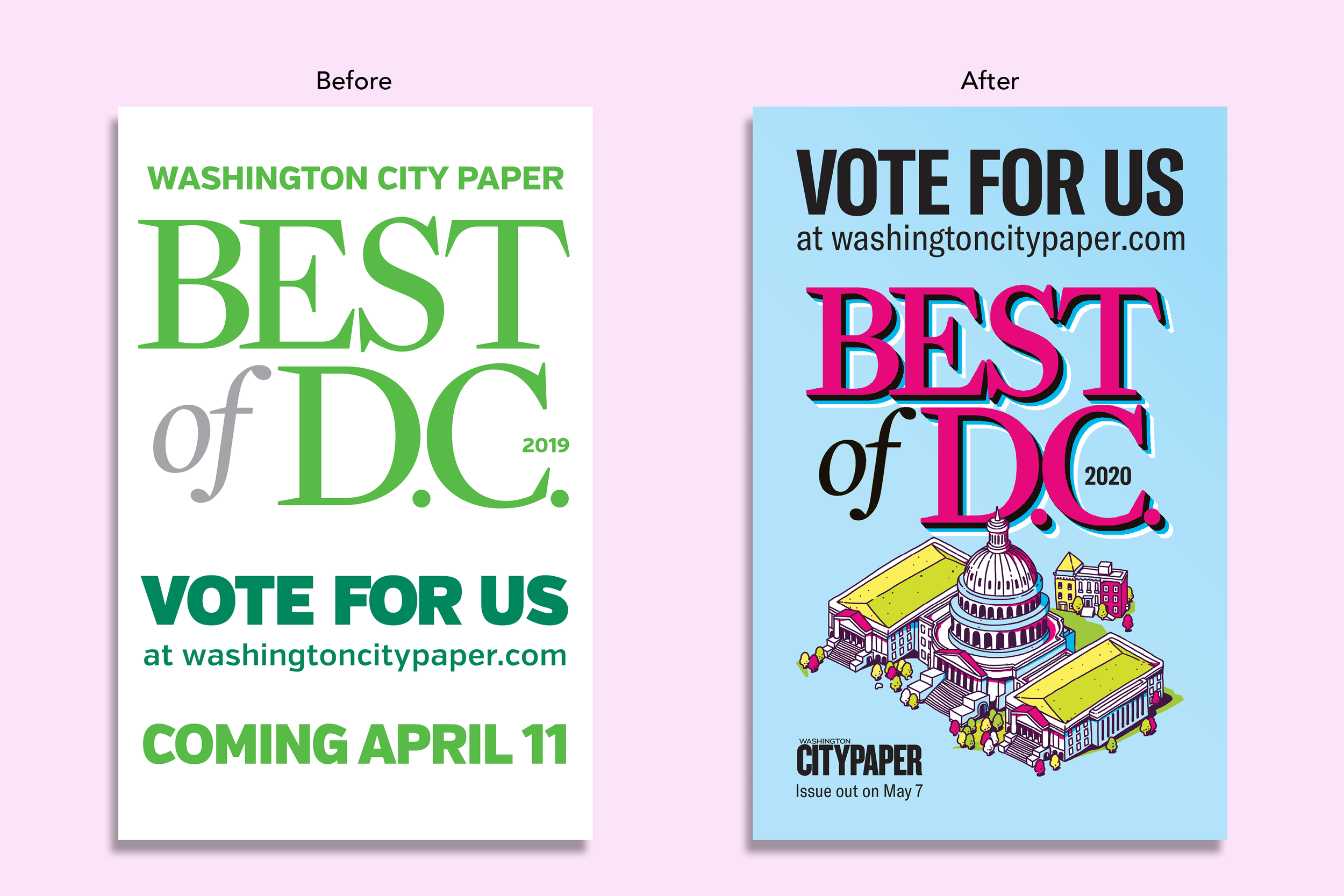
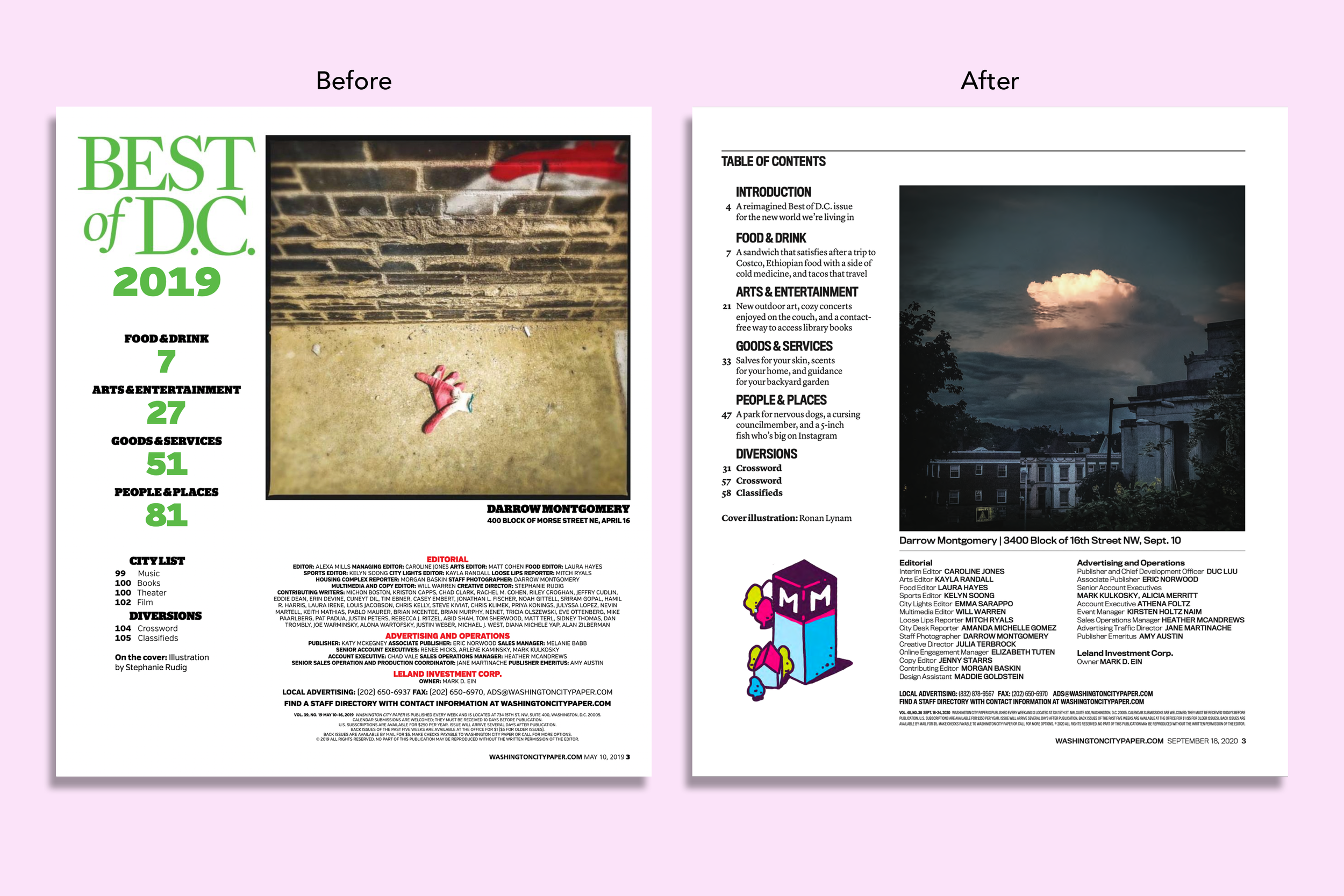
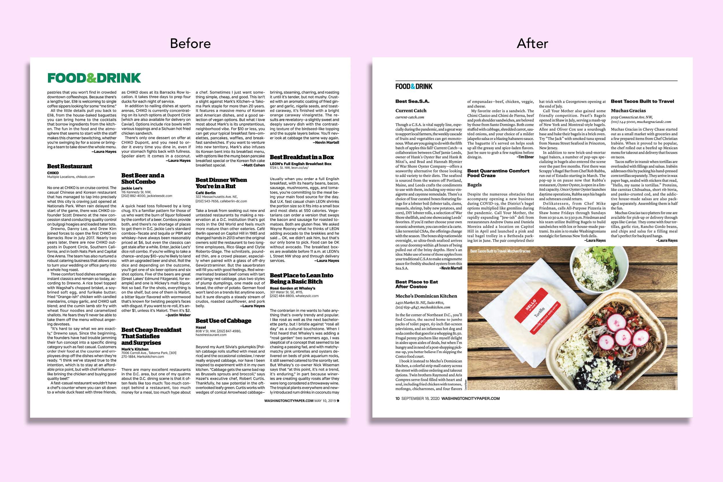
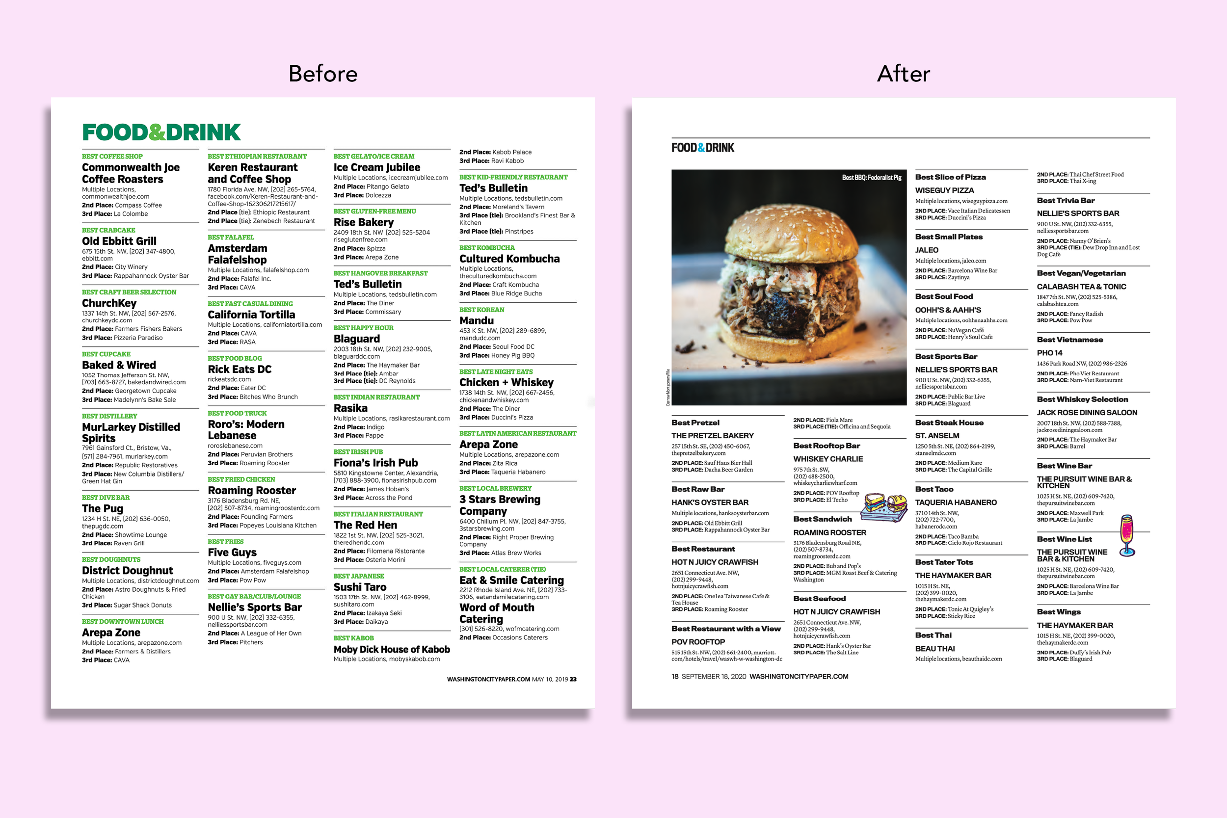
After the April 2020 redesign, there was a need for a new template for the annual Best of D.C. issue, a major revenue booster for the newspaper. Because the Best of D.C. issue’s cover is printed on glossy paper, it required a different paper size than City Paper’s weekly print issues. With Maddie Goldstein, we reimagined the structure and design of the issue’s main editorial sections: Readers’ Picks and Editors’ Picks. Then, we built InDesign pages that included paragraph and character styles that were resized for the issue using the same typography in the paper’s regular print issue. Maddie combined the Readers’ Picks, Editors’ Picks, and other editorial pages into a final InDesign master template sized specifically for this special edition issue. In August 2020, we designed the 60-page editorial issue on deadline, resulting in a special edition issue aligned with City Paper’s (regular issue) print redesign.
